

What’s in a colour? Visually speaking, we know it matters a lot in defining a space, setting a desired tone and ambiance. But how often do we take in the effects of our walls, the kinds of feelings that they evoke in us?
Well, subconsciously, we might do it more often than we think.
Lisa Abdullah, Colour Marketing and Communication Manager at Jotun Malaysia, shared, “We respond to the tones, hues, and shades we encounter every day consciously and unconsciously. Colour taps into our emotions, calms us, or energises us; it can make us think or spur us to action. In our homes, it’s often the nuances of colour that make all the difference.”
And that’s the operative word that Jotun is looking into this year: Nuances.
Shades of subtleties
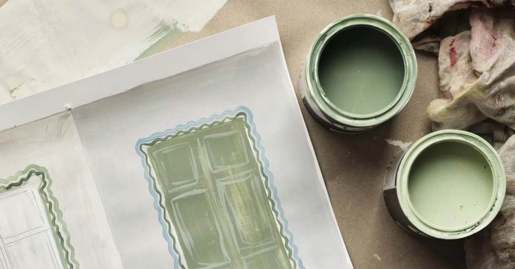
Nuances, Jotun’s 2025 colour chart, celebrates the power of subtlety and bold accents.
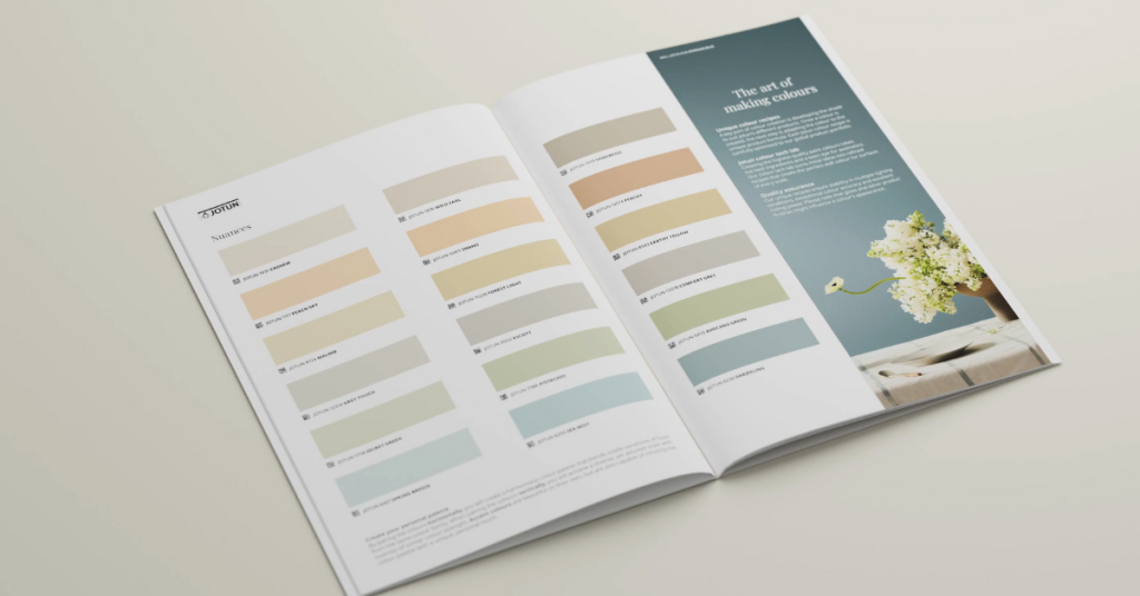
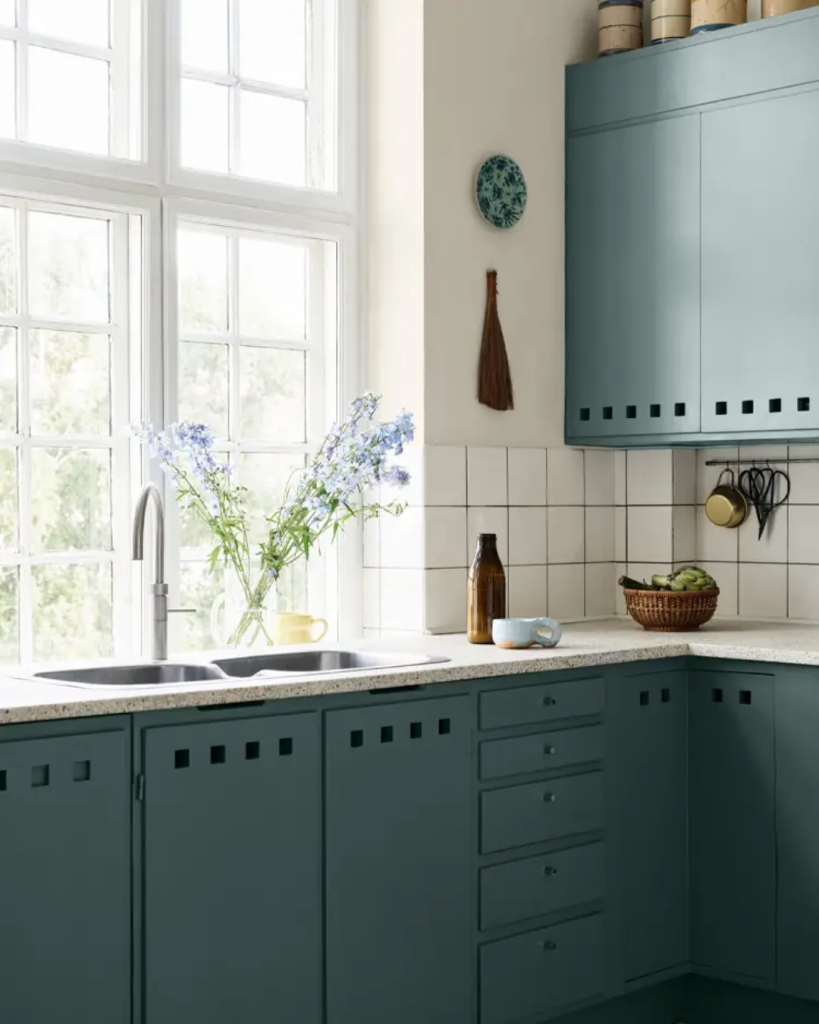
It features 30 colours across six families: blues, greys, peaches, yellows, beiges, and greens. Each family offers four soft variations and one bold accent colour.
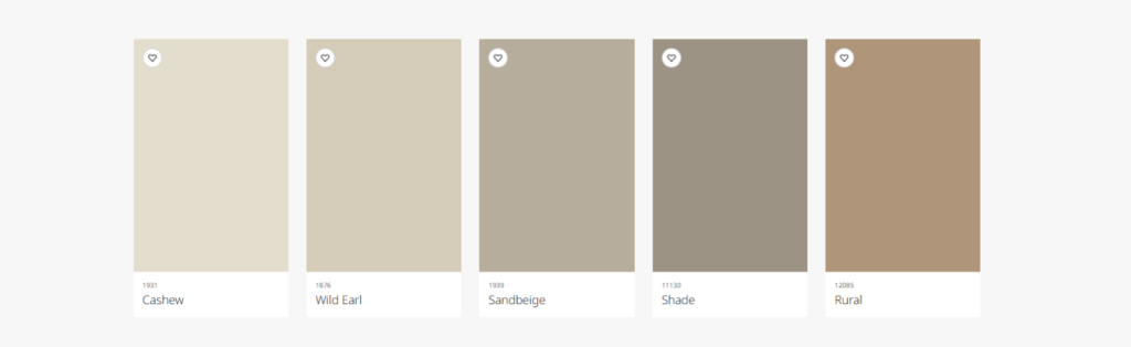
- Beige
- Cashew
- Wild Earl
- Sandbeige
- Shade
- Rural
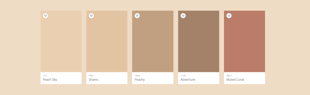
- Peach
- Peach Sky
- Shams
- Peachy
- Adventure
- Muted Coral
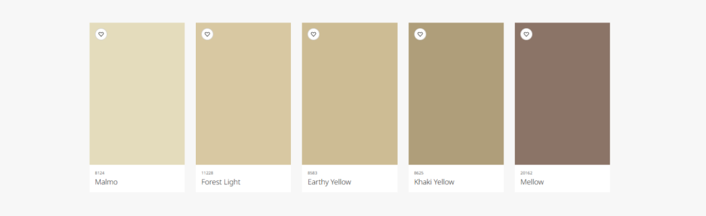
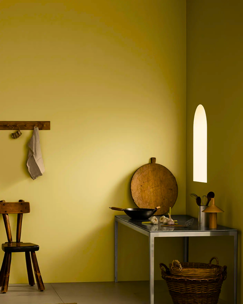
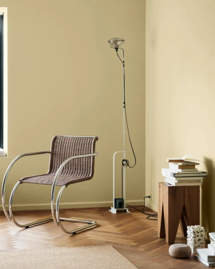
- Yellow
- Malmø
- Forest Light
- Earhy Yellow
- Khaki Yellow
- Mello
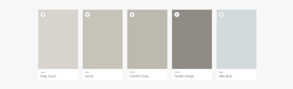
- Grey
- Grey Touch
- Ascott
- Comfort Grey
- Tender Greige
- Sky Blue
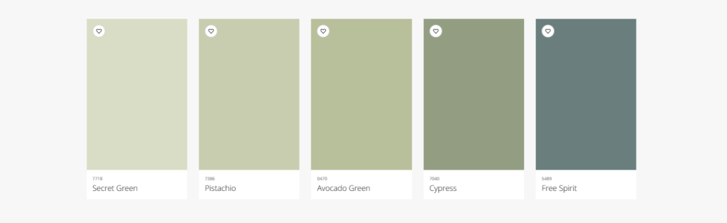
- Green
- Secret Green
- Pistachio
- Avocado Green
- Cypress
- Free Spirit
- Blue
- Spring Breeze
- Sea Mist
- Darjeeling
- Athenian Blue
- Sunny Green
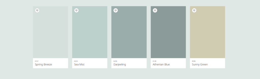
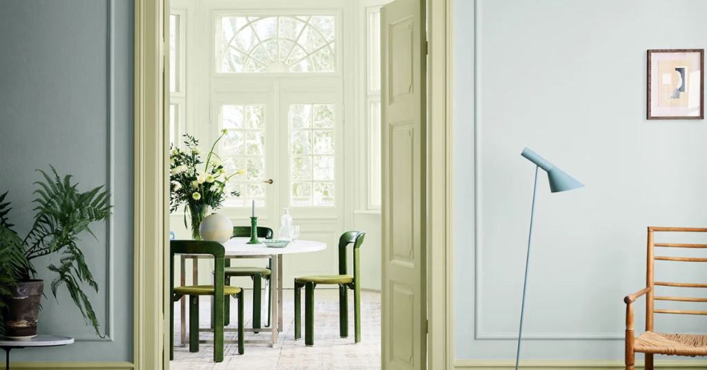
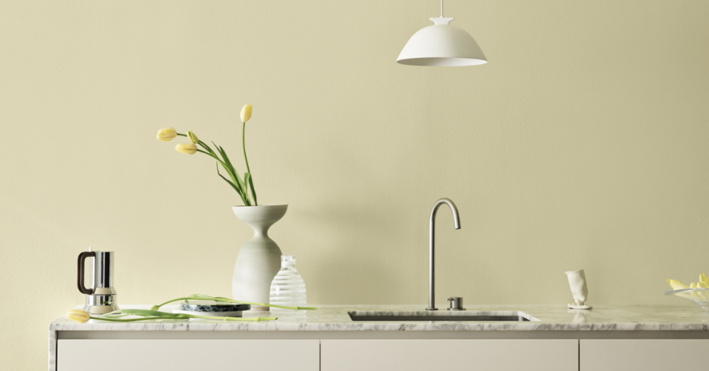
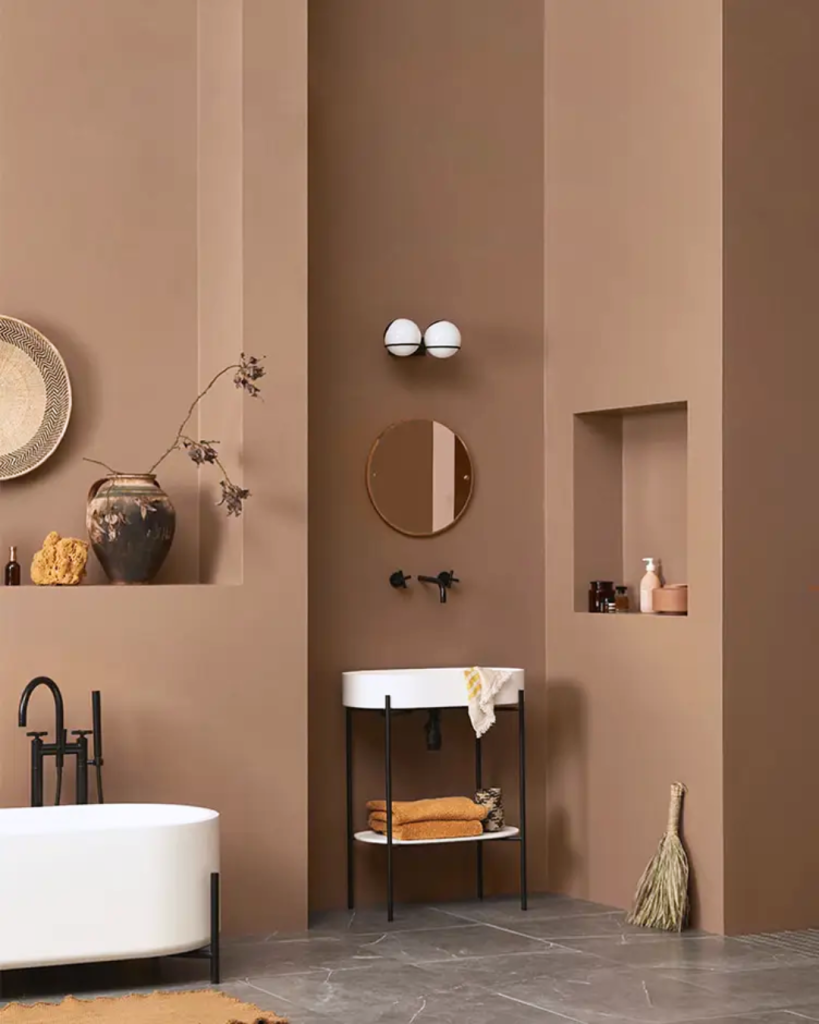
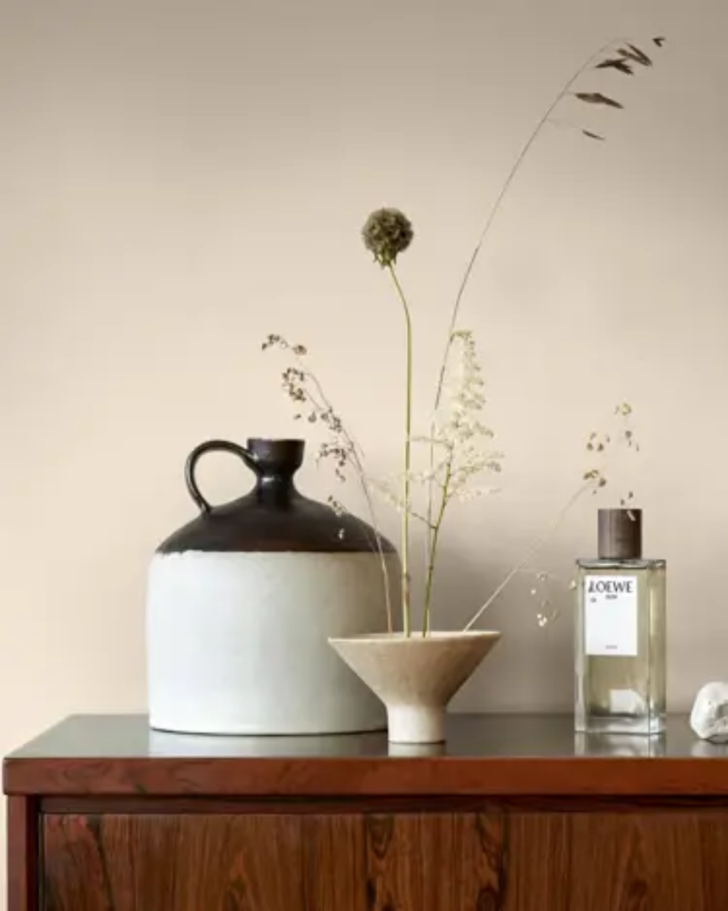
The beige tones are perfect to warm up spaces. Meanwhile, the peach nuances offer an extra earthy elegance. Yellow hues have the power to brighten, while the greys offer peace. Green and blue nuances both offer tranquility, offering a different perspective on nature.
The new colour chart is said to be “designed to inspire and guide you to add your own nuance to your everyday life.” With a clever use of colour theory, it invites others to explore shades and tones that add depth, warmth, and character to any space.
In other words, it’s a wonderful palette for anyone from design beginners to savants. It’s very generous in the sense that the harmonious tones can be mixed-and-matched to create a diverse assortment of combinations.
Perfecting each placement
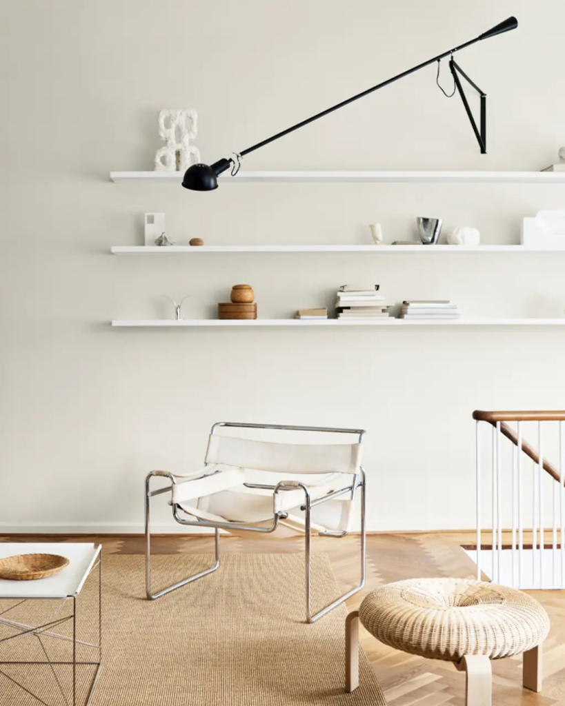
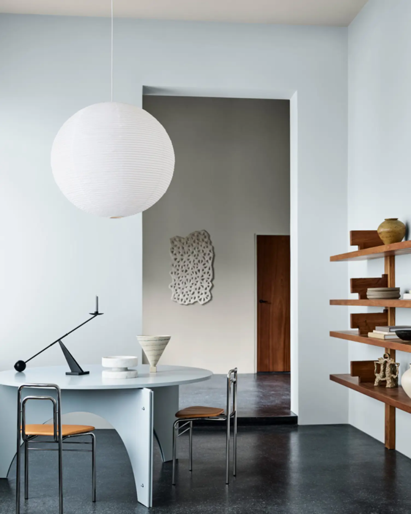
Living rooms get plenty of use—from lounging to hosting, it’s often the centrepieces of our home lives.
These spaces tend to be overrun with screens, decorations, and functional pieces, though, which is why people often choose a neutral shade to keep the balance.
That’s why, for living spaces, Jotun recommends its peach tones to inspire a deeper emphasis on being grounded and fully present. Grey shades also add a timeless elegance to the space, while yellows could help bring a more vibrant and youthful energy.
We’ve long known that green serves as a gentle reminder of nature, as well as a good resting colour for our eyes.
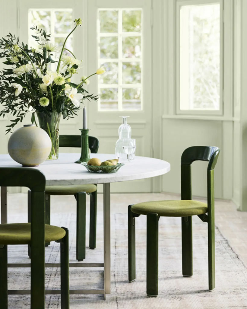
As such, Jotun’s green nuances, such as Pistachio and Cypress, are perfectly idyllic and ideal for workspaces.
These greens are on the lighter, more natural end, which still work to provide a calming visual break and reduce eye strain.
The Super Matt finish on Jotun Majestic Pure Color is a good option here, as it offers a smooth, uniform appearance without shiny spots. This anti-reflection quality minimises glare, making the environment more comfortable for the eyes.
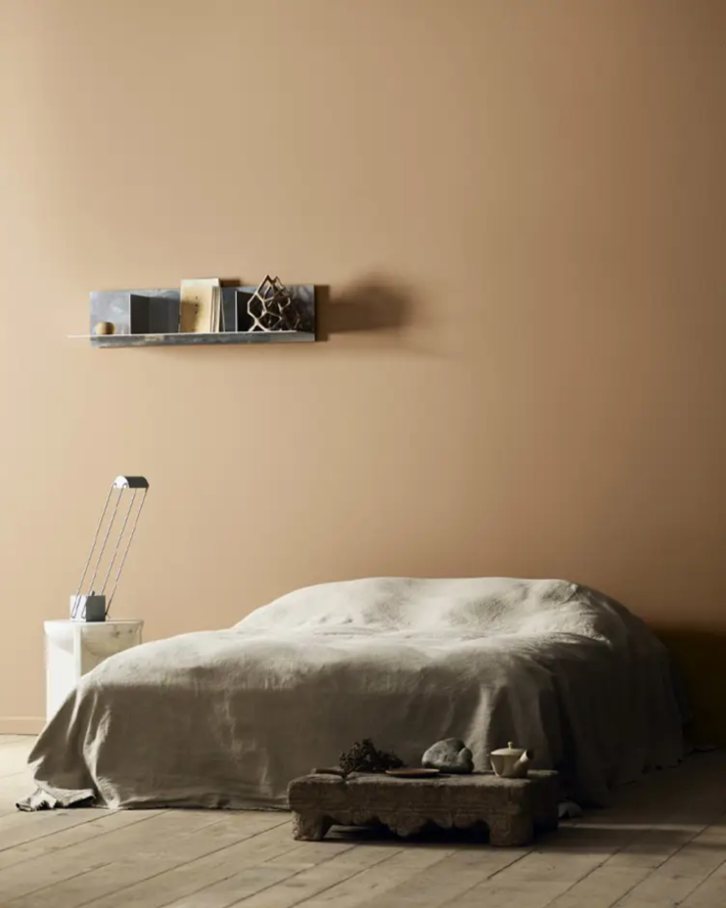
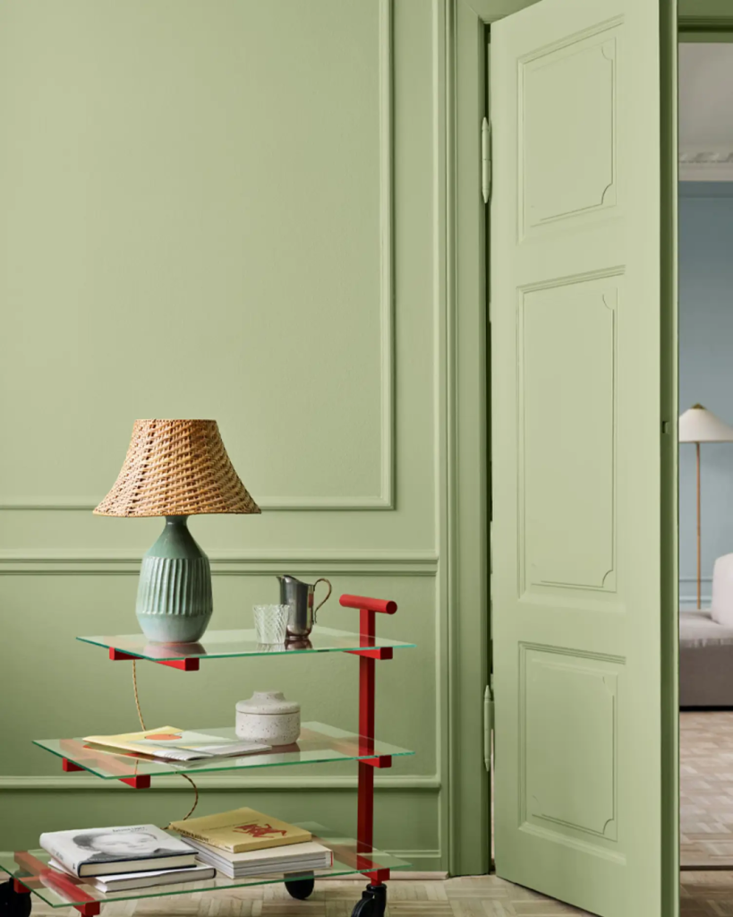
In the bedrooms, though, there is a vast assortment of colours you can choose from, depending on your personality and style. But if you’re looking to build a cosy sanctuary where slowing down is the objective, this Jotun collection has much to offer.
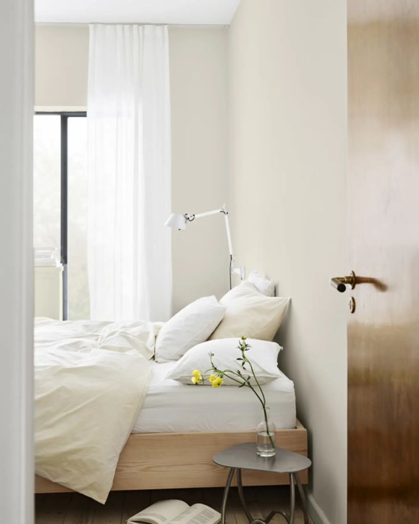
Beige, for one, is a neutral yet nuanced range that can bring feelings of calm. From Nuances, shades like Cashew or Wild Earl can help bring a sense of calm. Darker tones like the hearty Sandbeige might feel more intimate and warm.
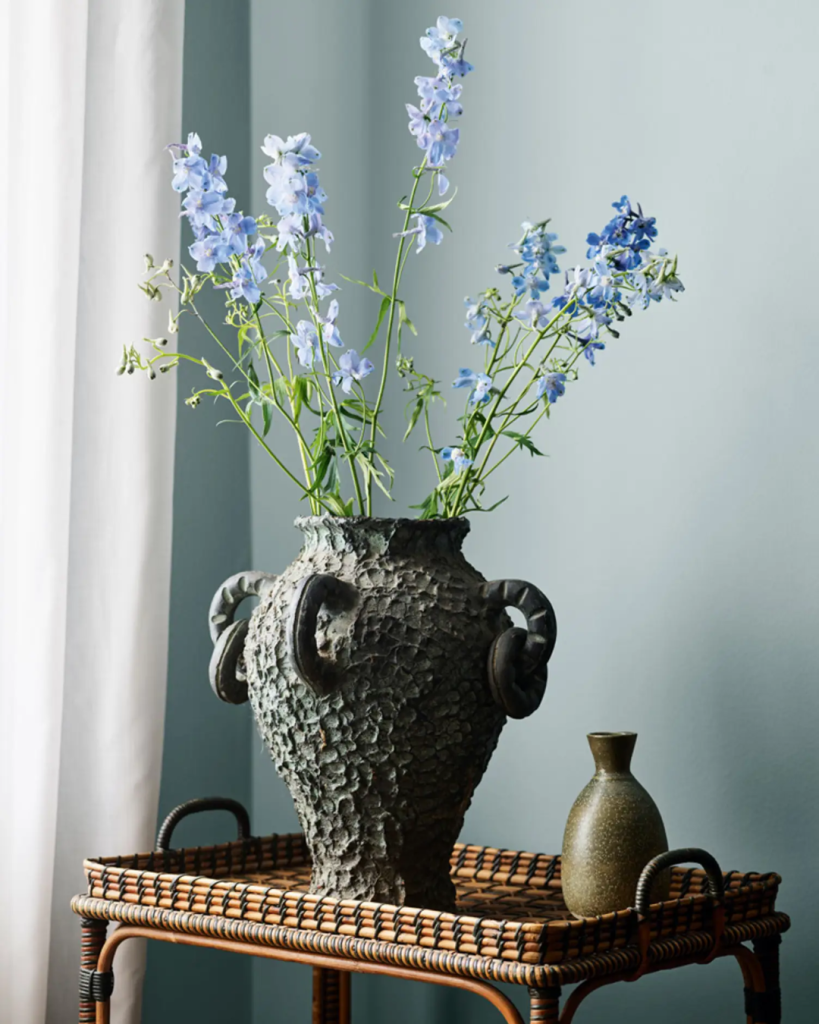
You could also go for Nuances’ blue shades, which feature green undertones that add a subtle layer of warmth and calmness to the room.
Colour us inspired
There’s no doubt that colours have a big impact on our spaces and our minds. In our homes, and on our walls, it’s often the nuances that make all the difference.
Jotun’s collection is an acknowledgement and celebration of that fact, offering us nuanced strokes of colours—and inspiration—to create our own ideal environment, mindfully.
Learn more about Jotun’s Nuances collection here.
Also Read: Inside: The Très Hotel, KL’s whimsical Wes Anderson-inspired staycation destination